Installation
npm i -D tailwindcss postcss autoprefixer
npx tailwindcss init -p
//tailwind.config.js

/** @type { import('tailwindcss).Config } */
export default {
  content: ["./index.html", "./src/**/*.{js,ts,jsx,tsx}"],
  theme: {
    extend: {}
  },
  plugins: []
};
/*index.css*/

@import "tailwindcss/base";
@import "tailwindcss/components";
@import "tailwindcss/utilities";
<!index.html>

<!doctype html>
<html>
  <head>
    <!...>
    <link href="./output.css" rel="stylesheet" />
  </head>
  <body>
    <!...>
  </body>
</html>
Text
Text Color
<p class="text-gray-700">This text is gray</p>
- Text color classes uses the format
text-{color}-{shade}, with shades ranging from 50 (lightest) to 900 (darkest) in intervals of 100.
Text Size
<p className="text-xl">Large Text</p>
- Text size classes are
text-xs(12px),text-sm(14px),text-base(16px),text-lg(18px),text-xl(20px), and up totext-9xl(128px) for increasing font sizes.
Font Weight
<p className="font-bold">Bold Text</p>
- Font weight classes are
font-thin,font-light,font-normal,font-medium,font-semibold,font-bold, andfont-extrabold.
Text Alignment
<p className="text-center">Centered Text</p>
Text alignment classes include text-left, text-center, text-right, and text-justify.
Font Family
<p className="font-mono">Mono Text</p>
- Font family classes include
font-sans,font-serifandfont-mono.
You can add custom fonts by extending the theme configuration in your tailwind.config.js file.
module.exports = {
  theme: {
    extend: {
      fontFamily: {
        customFont: ["Custom Font", "sans-serif"]
      }
    }
  }
};
Background and Borders
Background Color
<button className="bg-green-300">Click me!</button>
- Text background classes uses the format
bg-{color}-{shade}, with shades ranging from 100 (lighter) to 900 (darker) in intervals of 100.
You can add custom colors by extending the theme configuration in your tailwind.config.js file.
module.exports = {
  theme: {
    extend: {
      colors: {
        // Add your custom colors here
        primary: "#1a73e8",
        secondary: "#ff8c00",
        accent: "#d32f2f",
        customGray: {
          50: "#f9f9f9",
          100: "#f0f0f0",
          200: "#d9d9d9",
          300: "#c2c2c2"
        }
      }
    }
  }
};
Background Gradient
<div className="bg-gradient-to-r from-blue-500 to-green-500">
  Gradient Background
</div>
- Background gradient classes include
bg-gradient-to-t,bg-gradient-to-r,bg-gradient-to-b,bg-gradient-to-l, and diagonal directions likebg-gradient-to-tl, combined withfrom-{color},via-{color}, andto-{color}for multi-color gradients.
Background Radius
<div className="rounded-lg">Rounded Corners</div>
- Border radius classes include
rounded-sm,rounded,rounded-md,rounded-lg, up torounded-fullfor circular elements, and directional values likerounded-tl-mdfor a specific corner.
Border Radius
<div className="rounded-lg">Rounded Corners</div>
- Border radius classes can include directional values such as
rounded-tl,rounded-tr,rounded-bl, androunded-br. You can also use logical properties likerounded-s(start) androunded-e(end) for supporting different writing directions, available in sizes likesm,md,lg, andfull.
Border Width
<div className="border-2">Thick Border</div>
- Border width classes include
border,border-0,border-2,border-4, andborder-8, allowing control over the thickness of the border. You can also use directional values likeborder-t-2for just the top border.
Shadow
<div className="shadow-lg">Large Shadow Box</div>
- Shadow classes range from
shadow-sm(small shadow),shadow,shadow-md,shadow-lg,shadow-xl, toshadow-2xl(largest shadow), andshadow-noneto remove shadows.
Layout, Positioning and Sizing
Width
<div className="w-1/2">Half Width Content</div>
- Width classes include fixed values like
w-0,w-1,w-2up tow-96, percentage-based values likew-1/2,w-1/3,w-full, and other units such asw-screenandw-auto.
Height
<div className="h-32">Fixed Height Box</div>
- Height classes range from
h-0,h-1, up toh-96, as well ash-full(100% height),h-screen(full viewport height), andh-autofor automatic height.
Padding
<div className="p-4">Padded Content</div>
- Padding classes range from
p-0(no padding) top-96, allowing specific padding on all sides likepx-(horizontal),py-(vertical),pt-(top),pb-(bottom),pl-(left) andpr-(right).
Margin
<div className="mt-6">Margin Top Content</div>
- Margin classes range from
m-0(no margin) tom-96, as well as negative values like-m-4for negative margins, allowing specific margin on all sides likemx-(horizontal),my-(vertical),mt-(top),mr-(right),mb-(bottom), andml-(left).
Display
<div className="inline-block">Inline Block Content</div>
- Display classes include
block,inline-block,inline,flex,inline-flex,grid,inline-grid,table,hidden, and more, allowing elements to change their display behavior accordingly.
Position
<div className="absolute top-0 left-0">Top-Left Corner</div>
- Position classes include
static,relative,absolute,fixed, andsticky. You can position elements usingtop,right,bottom, andleftvalues, ranging from0tofull(100%).
Z-Index
<div className="z-50">High Z-Index</div>
- Z-index classes range from
z-0,z-10,z-20, up toz-50, andz-autofor automatic stacking order, controlling the layering of elements.
Container
<div className="container mx-auto">Centered Container</div>
- Container include
container,box-border,box-content,float-left,float-right,clear-both,object-contain,object-cover, and more, enabling various ways to control element layout and object fit.
Aspect Ratio
<div className="aspect-w-16 aspect-h-9">16:9 Aspect Ratio</div>
- Aspect ratio classes include
aspect-w-{width}andaspect-h-{height}, allowing you to set fixed aspect ratios like16:9,4:3, and more.
Breakpoints
<p className="text-sm lg:text-xl">Responsive Text</p>
Breakpoints are used to apply different styles based on screen size.
sm:for small screens (≥ 640px)md:for medium screens (≥ 768px)lg:for large screens (≥ 1024px)xl:for extra-large screens (≥ 1280px)2xl:for very large screens (≥ 1536px)
You can add these prefixes to any class to change the style at different screen sizes. For example, text-sm will apply by default, but lg:text-xl changes the text size to larger when the screen width reaches 1024px.
You can change the default breakpoints in the tailwind.config.js file.
module.exports = {
  theme: {
    screens: {
      sm: "640px",
      md: "768px",
      lg: "1024px",
      xl: "1280px",
      "2xl": "1536px",

      //Custom breakpoint
      custom: "900px"
    }
  }
};
Flexbox and Grid
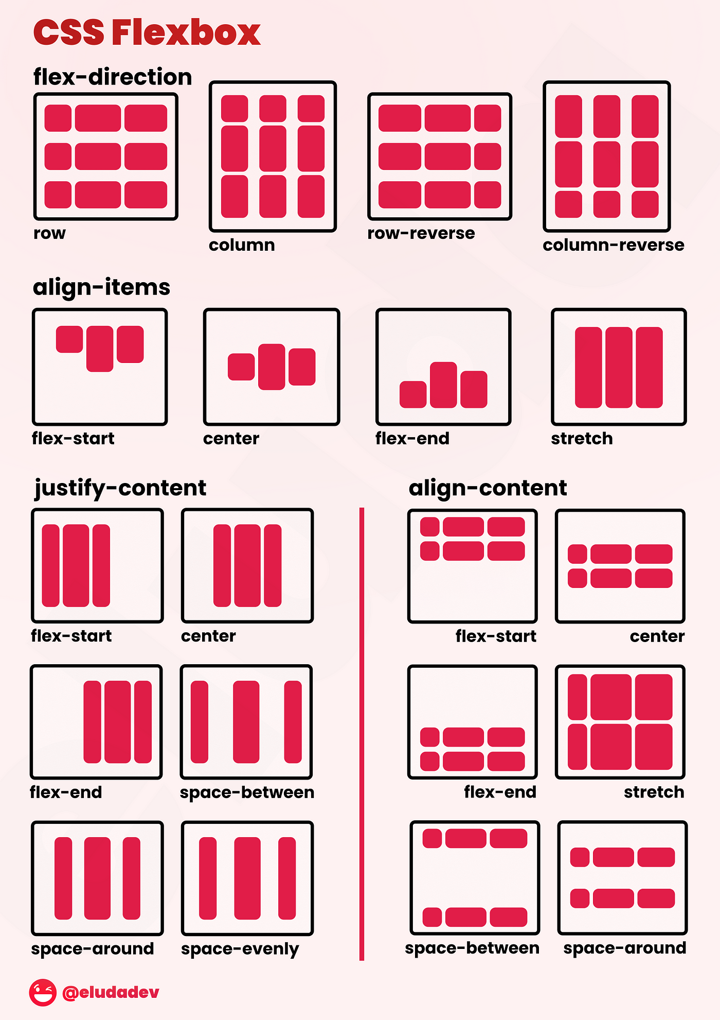
Flex Container
<div className="flex">Flex Container</div>
- The
flexclass makes the element a flex container, enabling flex behavior for its children.
Flex Direction
<div className="flex flex-col">Vertical Flex</div>
- Flex direction classes include
flex-row(horizontal) andflex-col(vertical) to control the direction of the flex items.
Justify Content
<div className="flex justify-between">Spaced Out Content</div>
- Justify content classes include
justify-start,justify-center,justify-end,justify-between,justify-around, andjustify-evenly, controlling the horizontal alignment of flex items.
Align Items
<div className="flex items-center">Centered Flex Items</div>
- Align items classes include
items-start,items-center,items-end,items-baseline, anditems-stretch, controlling the vertical alignment of flex items.
Flex Wrap
<div className="flex flex-wrap">Wrapped Flex Items</div>
- Flex wrap classes include
flex-wrap,flex-wrap-reverse, andflex-nowrap, determining if items should wrap onto multiple lines.
Align Self
<div className="flex">
  <div className="self-end">Aligned to End</div>
</div>
- Align self classes (
self-start,self-center,self-end,self-stretch,self-baseline) control how a single flex item aligns inside the flex container.
Grid Container
<div className="grid grid-cols-3">Three Column Grid</div>
- The
gridclass creates a grid container. Usegrid-cols-{n}to define the number of columns (e.g.,grid-cols-1togrid-cols-12).
Grid Rows
<div className="grid grid-rows-2">Two Row Grid</div>
- Grid row classes include
grid-rows-{n}to define the number of rows, similar to column classes.
Column Span
<div className="col-span-2">Span Two Columns</div>
- Column span classes (
col-span-1tocol-span-12) allow grid items to span across multiple columns.
Row Span
<div className="row-span-2">Span Two Rows</div>
- Row span classes (
row-span-1torow-span-12) let grid items span across multiple rows.
Gap
<div className="grid gap-4">Grid with Gaps</div>
- Gap classes (
gap-0togap-96) set the space between grid or flex items. You can also usegap-x-orgap-y-for horizontal or vertical gaps.
Interactivity and Utility
Pseudo-Classes
<button className="hover:bg-blue-500">Hover Me!</button>
- Pseudo-classes include
hover:,focus:,active:,visited:,disabled:,checked:,first:,last:,odd:,even:,group-hover:, and more, enabling conditional styling based on user interactions or element state.
Dark Mode
<div className="bg-white text-black dark:bg-black dark:text-white">
  Light/Dark Mode Content
</div>
- Tailwind provides support for dark mode styling, allowing you to toggle between light and dark themes easily. You can configure dark mode using the
darkvariant.
Visibility
<div className="invisible">Invisible Content</div>
- Visibility classes are
visibleandinvisible. You can also useopacity-0toopacity-100to make elements transparent or fully visible in 10% intervals.
Cursor
<button className="cursor-pointer">Clickable Button</button>
- Cursor classes include
cursor-pointer,cursor-default,cursor-move,cursor-not-allowed,cursor-wait,cursor-help, and more to define the type of cursor shown when hovering over an element.
Overflow
<div className="overflow-auto">Scrollable Content</div>
- Overflow classes include
overflow-auto,overflow-hidden,overflow-visible,overflow-scroll, and directional values likeoverflow-x-scrollfor horizontal scrolling.
Transform & Transition
<div className="transform hover:scale-110 transition duration-300">
  Hover to Enlarge
</div>
- Transform and transition classes include
transform,scale-{value},rotate-{degrees},translate-x-{value},translate-y-{value}, as well astransition,duration-{ms},ease-linear,ease-in, and more to control animations and transformations.
Animations
- Tailwind has built-in classes for animations like
animate-spin,animate-ping,animate-pulse, andanimate-bounce, which can be used to quickly add movement to elements.
<div className="animate-bounce">Bouncing Element</div>
- But you can also define your own custom animations using the
@keyframesCSS rule.
module.exports = {
  theme: {
    extend: {
      animation: {
        "spin-slow": "spin 3s linear infinite"
      }
    }
  }
};
<div className="animate-spin-slow">Slow Spinning Element</div>
Arbitrary Values
<div className="w-[450px] h-[300px] bg-[#1a73e8]">Custom Width and Color</div>
- You can use brackets
[]to define custom values for properties like width, height, color, padding, margin, etc., which is useful when the default values don't meet your exact needs.
Arbitrary Variants
<div className="hover:[text-decoration:underline] md:[text-align:right]">
  Custom Variants
</div>
- Similarly, you can create custom variants for states or responsive behavior.